
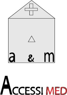
I decided to combine the logo and the text and made a much more pleasing logo. I added colour, too since the other one was too mundane and more shapes so it wasn't plain. The perspective I think gave it a more 'eye-turner' feel to it.

|
|
I was somewhat trying to convey a bubbly somewhat fun text to represent my personality, but of course, I've still got a lot to learn. The logo after my name is a company that I am currently working with. I've done their designs before on paper, but I wanted to try on digital media. Not very accurate to my original but close.
