Micrography Example


This is a logo I found online, and I'm not sure if it belongs to a real company or not. I chose this logo because I thought it was interesting to use the chain links as the 'M'.
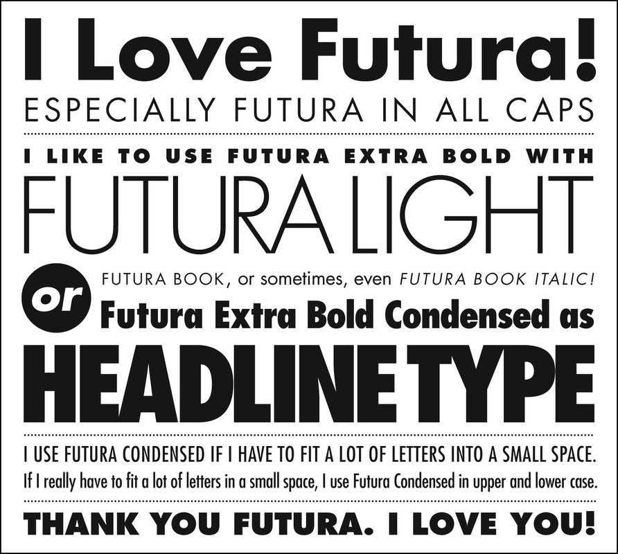
Fonts
I like the 'Futura' font - I'm drawn to the clean and simple lines. I like clean and uncluttered design, and the futura font seems to be that way; no extra curly things at the ends or unnecessary curves. Futura font was invented in 1927, and it just reminds me of an old newspaper headline or something.
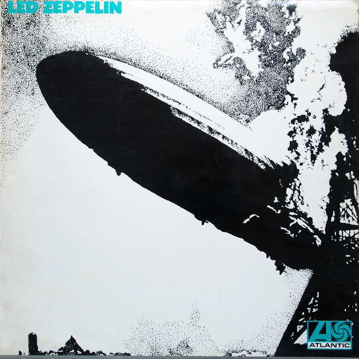
Band logo is modified version of Futura Extra Black